Imagining a World With a Redesigned Calibre-Web

I'm a super huge fan of open source projects like Calibre-Web. Not only do they breath new life into old dusty virtual libraries, but they provide a real alternative to the towering corporate monopolies that seem impossible to usurp.
Let's face it, I think we're all well aware now that companies like Amazon, Spotify, and Google generally do not have our best interests in mind when they attempt to monopolize new industries.
So when I found out about Calibre Web, my heart didn't just skip a beat, it stopped altogether. It's safe to say that it was love at first sight.
And overall, moving over to an open-source, self-hosted alternative to the big eBook providers has been a great experience. I'm loving feeling that I have complete control of my ebook library, and that I'm not locked in someone's basement forced only to eat from their dingy kitchen. I know that, now, with the help of Calibre and Calibre-Web, I am able to take my eBook library wherever I deem fit, and if I decide I no longer want to purchase books from one provider, it won't mean having to split my library in half.
But with all of that said, we need to address the elephant in the room.
The Problems with Calibre-Web's Design
Because this is not exactly the kind of user interface that we've come to expect from a product in the modern era:
I wouldn't go as far as calling it Terrible (with a capital T) because there are things that I genuinely like about the design. They make good use of action and wayfinding icons (i.e. the little silhouette of a man for the admin button), and the teal is really doing it for me.
But that's about where my compliments end.
Some of the things that I don't love about the current design include:
- There are 8 large buttons, each one for a different sort option in the main books view. None of the icons in the buttons really do a very good job at denoting how exactly it will sort the books. Additionally, there is not text on these buttons to clarify what they do exactly. They also take up valuable screen real estate that could be better used on other features.
- There's a lot of redundant information and features unnecessarily taking up space. For instance, nearly every book ever has a book cover that includes a book title on it. Nonetheless, titles & authors are typically shown twice per book. Additionally, there are two different search features right next to each other. In my opinion it makes much more sense to have a single search that you can expand to a more advanced view as needed. Lastly, there are even two different buttons labeled "admin". Which one does which? It's not clear.
- Thirdly, I think the design here in generally is pretty inconsistent. Some things are rounded off while others have sharp corners, the blue generally clashes rather than accents the teal, and there's not a clear visual hierachy in many pages.
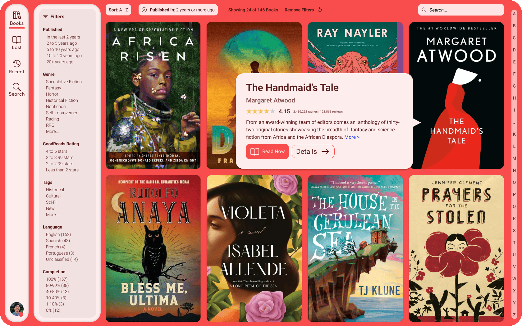
A home-screen worthy of lust.
So to address these concerns I had, I thought to myself: What would Calibre-Web look like if it had a clear, consistent, and need I say, opinionated design language, that invites the users to fall in love with what they're there to interact with: their books.
I wanted to imagine something that would put the beautiful artwork that many people love about their books collections, and spend a ton of time curating, by the way, front and center, in large format, and without being surrounded by additional redundant and distracting text.
Enter Calibre-Web, Redesigned.

One of the main things that I've been interested in from a UI/UX design standpoint for desktop projects that I've designed is having the primary navigation buttons for the website/app be on the left side. On mobile, it makes sense having core navigation at the bottom of the screen where you can easily access them with your thumb, but on desktop, I think the primary consideration should be visual hierarchy (i.e. making it clear that these are the top-of-the-pyramid buttons that will control everything else on screen in terms of what's visible) and making good use of space.
It's for that reason that I started my design out with navigational buttons that live on the left side of the display. In western societies, we are taught at an early age to read left-to-right, and top-to-bottom. So for us in the west, what is located in the top left corner of any screen is going to be the most important element in the mind of the user. What could be more important for a book library app than the books in your library?
I also wanted to explore the concept of creating a website/desktop app that isn't bogged down with the need to brand itself throughout the user's experience of using it. This high-value real estate is typically reserved for logos that navigate to the "home" page, and what exactly a "home" page is varies greatly, from landing pages, to pages dedicated entirely to navigation, to discovery pages, etc.
Instead, by having this space occupied by a button that represents the most important, core function of your app, you signify to the user that what they came here for is what matters. You are putting their needs over your branding. And what could be more satisfying for a user than to have your needs put above all else? Is that not the point of software in the first place? To serve the humans that are using it?
I also wanted to experiment with an app design that would stay out of the way of the user. So often apps want to be the center of attention over the purpose that they are meant to serve. For instance, in the operating system space, you often have core system apps where the operating system's functions themselves take over huge amounts of the available real estate.
Instead, I wanted to imagine an eBook library app that, when the user logged in, they would be thinking about their books, not the app that is serving it to them. For that reason, I wanted the book covers to be large and carry a lot of visual weight. While this design shows the user knows that the navigational buttons are the most important buttons on the page in terms of their location, in terms of size, it's clear that the books are the focus here.
Thank you for reading. If you like the redesign, feel free to let me know.