Daedalus Ink Branding, Website Redesign & Marketing
This marketing case study is personal for me
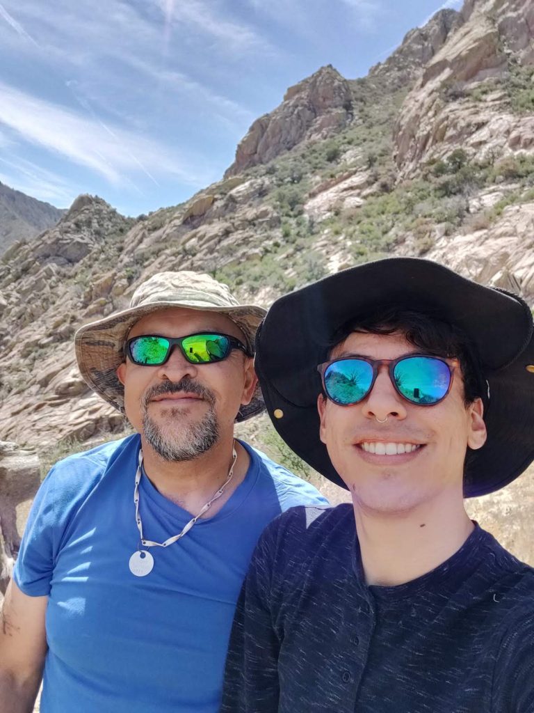
As a new freelancer, I knew that working on marketing for Daedalus Ink would be an experience that I would always cherish. DeadalusInk.com is owned my father, a man who spent nearly 20 years of my childhood in prison. Being able to work with my dad on this project was a way for us to continue to grow and develop our relationship.
Daedalus Ink is a project by my dad created to tell stories of his life and share his experiences.


Services Provided
Below is the list of the marketing services I provided for Daedalus Ink that I’d like to cover in this case study. Click each topic to jump to that section of the case study.
- Visual Identity
- Digital Branding Guide
-
Proof-Reading
-
Social Media Management
Brand Messaging & Identity
I love when I have the opportunity to work on what I consider to be one of the most foundational components of a business: Brand Messaging and Identity.
Creating a Solid Foundation
Before design, SEO, Email Marketing, or anything else comes, an organization needs to know what they stand for and how they fit into their customers’ lives.
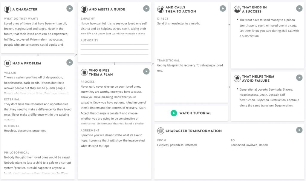
To help with this process, I like to use the StoryBrand framework developed by Don Miller. Many thanks to my very talented friend Dai MacDonald for turning me onto this framework.
This framework is based on the idea that every great brand understands their customers’ stories, and knows how to become a part of that story.
Because of this, StoryBranding requires us to critically think about the stories of our customers, including who they are, what problems they have, how you can guide them in their journeys, and what positive outcomes you can help them achieve.
The key components of this framework, and some of the messaging work we did for this project can be seen below.

This brand messaging exercise was an emotional experience
Having this conversation with my dad was compelling in many ways. We laughed, we cried, and at one point during the conversation, my boyfriend came in from the other room, emotionally charged and touched from hearing the messaging we were crafting.
To be able to bring into focus what his mission was, what he was really trying to do with this website, was emotional work that was well worth it. The messaging we created was compelling, and proved how important this work is.
One of the most powerful sentences that came out of it was “Nobody believes that their family member would end up in a cage”. This was the philosophical problem that we are trying to tackle with Daedalus Ink.
Once we had the brand messaging down, we had a foundation for the rest of his website copy. We could use this messaging on any and all future communications, including emails, social media posts, and more.
Visual Identity
Cinzel
Reenie Beenie
Nunito Sans
Before we began discussing visual identity, I had my own ideas for what Daedalus Ink would look like. I thought of words such as “Masculine”, “Timeless”, and “Heartfelt”. But as soon as I probed my dad to describe an aesthetic he was interested in, he used words that stopped me dead in my tracks.
The conceptual words he wanted to center on were “Surrealist” “Deviant”, “Perseverance”, “Grungy”, “Ghetto”, and “Thought-provoking”.
Of course he would use these words: they were profound and deep in ways that only the creator of this project could conjure.
For the typefaces of the brand, I suggested using something that would represent a cross between old and new, as the concept of his site is based on social issues of our day, but also the fables of Daedalus, a prolific inventor of ancient Roman’s tales. He lept at the idea, so I included in my flagship brand concept Cinzel, a modern font with proportions based on ancient Roman lettering.
He also loved the idea of using a script font, because it reminded him of writing letters while in prison. Reenie Beenie felt most appropriate, and was also included in the flagship concept.
This brand concept was named “The Ink of My Mind’s Eye” to represent the rich internal world of a writer in prison. It uses bursts of vibrant colors over black, but atop a monochromatic base that represents the sterility of the prison industrial complex.
Creating an Online Dedicated Digital Branding Guide
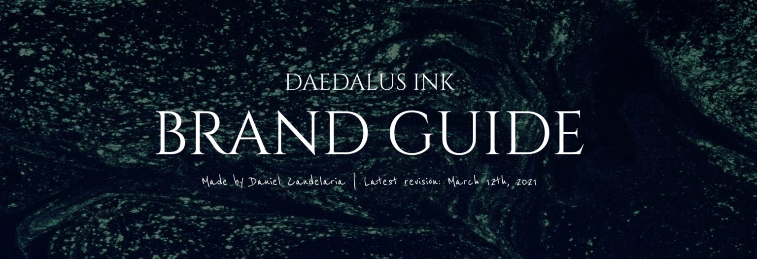
Once the branding work was complete, I created an online digital branding guide that could be accessed at any time. This document is living, it is breathing, and it is always available in the most up-to-date-form.
Unlike many branding guides, the most up-to-date version of this document is always available to anyone that wants to work with Daedalus Ink from partner organizations, press, guest writers, graphic designers and more.
It serves as the perfect single point of reference for all things branding.

Website Design & Development
My Website Design Process
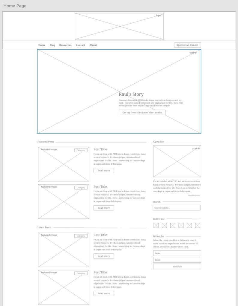
One thing that I make sure to do when I’m designing websites is to get plenty of input along the way. I want to make sure that my client is happy with how the website works. It also pays dividends to get the design right before starting the build. My process is below:
1. Find Inspiration
2. Design Wireframes
3. Build Website
4. Test & Go Live
Proofreading Services
When I began to work on this project, one thing I wanted to make sure of is that any work I provided was professional and free of errors to the best of my ability.
But one thing I am definitely not is a professional proofreader, which is why I’m so lucky to have a network of individuals from the marketing world that makes it possible for me to provide this service at a very high quality.
The proofreader I work with is Kelly MacDonald.
